Fast-food chain Long John Silver’s has unveiled a redesigned logo that replaces its signature fish design with a chicken as part of a larger effort to showcase its versatility and “spark conversation.”
The refreshed branding, introduced Oct. 3 across digital platforms, also features a new tagline of “CHICKEN + SEAFOOD,” according to a news release from the company.
“Guests have been telling us for years that our chicken is a best-kept secret,” Christopher Caudill, senior vice president of marketing and innovation at Long John Silver’s, said in a statement. “Our hand-battered chicken strips — known as Chicken Planks — are every bit as crave-worthy as our legendary fish. It’s time we let that secret out.”
POTATO CHIP BRAND UNVEILS BIGGEST REDESIGN IN NEARLY 100-YEAR HISTORY
The redesign follows “successful product testing” at the chain’s flagship restaurant in Louisville, Kentucky, that offered chicken in a range of new forms, as noted in the news release.
Chicken is also taking center stage in the chain’s $6 Basket lineup, which includes Chicken Planks, hand-battered fish, batter-dipped shrimp and grilled shrimp, according to Long John Silver’s.
DOMINO’S REBRANDS FOR FIRST TIME IN OVER A DECADE
However, the fast-food chain insists that seafood remains central to its identity, with fan favorites like wild-caught Alaska fish, crab cakes, surf clams and grilled salmon remaining on the menu.

“This brand was built on making the coastal experience accessible to everyone, so seafood will always be part of our DNA,” Caudill said in a statement. “But chicken is also part of our heritage — and a big part of our future — so it deserves its rightful place on our logo, our menu and our guests’ tables.”
CRACKER BARREL DUMPS CONSULTING FIRM PROPHET AFTER MAJOR REBRAND BACKLASH FROM CUSTOMERS
The update comes amid a wave of high-profile rebrands across the food industry.
PepsiCo’s Lay’s recently announced the “largest brand redesign” in its nearly 100-year history, and Domino’s Pizza is undergoing its first rebrand in more than a decade.

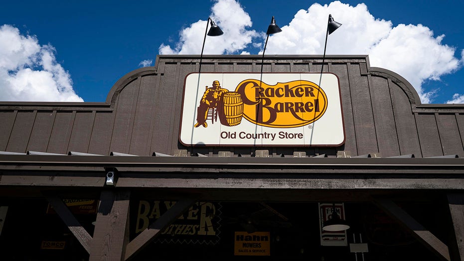
Cracker Barrel is still recovering from backlash over its failed modernization attempt. The move triggered intense backlash, a steep drop in stock value and an eventual reversal.
Long John Silver’s did not immediately respond to FOX Business’ request for comment.
Read the full article here


Leave a Reply